UK infections and deaths rising again

Since the summer the UK has once again become an outlier with infections and deaths rising faster than other large European countries. Health authorities are worried about renewed pressure on hospitals while the government is holding back from introducing any new restrictions.

Source: ourworldindata.org

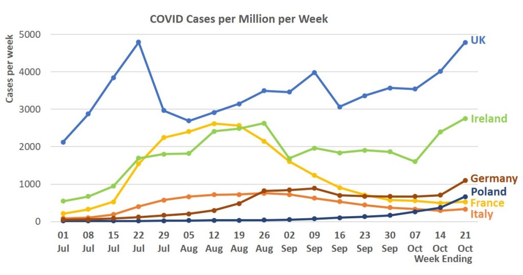
The sudden surge in deaths recorded in Ireland is a bit of a surprise. Sometimes these big spikes in data come from an adjustment where old data is corrected but the numbers show as new. But Ireland has rising infections so we will have to wait and see.

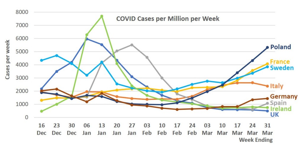
The only very big European country missing is Spain, I stopped including Spanish data when a series of adjustments made it difficult to see what was happening. But I’ll look at whether that problem is past and whether it’s possible to include Spain again.

Promising but fragile for UK

The split picture in Europe continues, with UK and Ireland continuing to look promising but other countries who did not have a Christmas surge now seeing a Spring surge.

As Britain comes out of lockdown these numbers will become crucial.

Source: European Center for Disease Control, via ourworldindata.org
Compiled 31 03 2021
Source: European Center for Disease Control, via ourworldindata.org
Compiled 31 03 2021

Situation improving in UK, Spain & Ireland but cases rising elsewherE

Sweden, France, Italy and Poland have all seen cases rise over the past three weeks. So nothing is certain given the concerns about new variants of the virus.

These charts cover the biggest European Countries plus Sweden because of its different policies and Ireland as our closest neighbour with a great many connections and a land border with the UK.

Update 16 Mar, two weeks onward this trend is continuing

Source: European Centre for Disease Control via ‘Our World in Data’ website
https://ourworldindata.org/coronavirus-data-explorer
Compiled 3 March 2021
Updated 16 March 2021 (new data)
Source: European Centre for Disease Control via ‘Our World in Data’ website
https://ourworldindata.org/coronavirus-data-explorer
Compiled 3 March 2021
Updated 16 March 2021 (new data)

The burden on UK National Health Service

This chart compares the patterns of COVID hospital admissions, patients in hospital and deaths over the past year. It shows very starkly that the second surge of the virus has had a much much greater impact. Deaths are 54% higher than earlier but the load on the NHS is 121% higher.

NB Clearly each of these graphs is to a very different scale. I have given them a common scale based on the level at the end of March when deaths and admissions peaked.

I had hoped to include a chart for the whole of Europe for comparison but the ECDC does not publish that data, probably because some countries do not have reliable data for hospital occupancy.

Compiled 21 February 2021
Data from European Centre for Disease Control (ECDC) via ourworldindata.org

Patterns across the world

We have had enough time for the Pandemic to take hold right across the world. These figures are quite crude but they give a picture of how things have developed in the different continents.

Updated 6 Mar 2021 (new data and populations corrected)
Compiled 13 Feb 2021
Data from European Centre for Disease Control via ourworldindata.org

We know that many Asian Countries have been very effective in containing the infections so that’s no surprise. The chart may also illustrate the way that air travel has been a real driver for the spread with the affluent countries of North America and Europe first to peak, South America and Africa some way behind, possibly reflecting the proportion of the population who travel outside their own countries or region.

We might question whether data gathering in Africa has been as reliable as other areas where the infrastructure is stronger, but actually observers have said that African countries have been particularly good at using public health measures to contain the spread.

The whole pattern

Here is a chart showing my group of European countries over the whole period of the pandemic since deaths started. These 4-weekly charts do not help with the immediate picture but they do show the pattern of the epidemic in different countries very well.

Data from the European Centre for Disease Control & Prevention, via ourworldindata.org
Compiled 12 Feb 2021

The two big surges are very evident, but also seasonality has to be questioned considering that infections for the second surge started in September when weather was still mild.

UK, Ireland and Sweden started later than the ‘mainland’ countries in Europe, where travel between countries is probably much more prevalent, and that may indicate the role that travel plays.

It’s sad to see that Poland and Germany, which both did very well in the first surge, were unable to keep their good record in the second.

UK and Ireland both lifted restrictions at Christmas and that seems to have a big effect. Ireland had been doing very well up to that point.

Maybe we’ve past the peak of infections, but it’s not over.

The most recent numbers across Europe indicate that lockdown measures may be working with new infections generally falling. Deaths are still high, and rising in many countries, so it will probably be a while before we see proper relief from the extremely difficult situation for health workers.

Data from the European Centre for Disease Control & Prevention, via ourworldindata.org
Updated 20 Feb 2021 (new data)
Updated 12 Feb 2021 (new data)
Compiled 6 Feb 2021
Data from the European Centre for Disease Control & Prevention, via ourworldindata.org
Updated 20 Feb 2021 (new data)
Updated 12 Feb 2021 (new data)
Compiled 6 Feb 2021

UK Excess Deaths record & Covid

At the start of 2020, deaths in the UK were running at a lower level than in the previous five years, possibly because of mild weather. From the start of Covid deaths in March excess deaths in the UK, compared to the previous five years, rose rapidly and at a higher level than recorded Covid deaths.

These figures have often been cited as evidence that Covid has killed more people than officially recorded. It has also been said that the pandemic has led to other deaths, eg from untreated disease, that have added to these figures.

It might be reasonable to conclude that early on the impact was mainly directly from Covid and non-Covid, Pandemic-related deaths would start to show later in the year. However the excess death numbers dropped below the Covid deaths in the summer and have stayed lower. One possible explanation is that other infectious diseases, particularly influenza, have been suppressed bu the anti-Covid measures.

The total deaths figures are not available as quickly as Covid data, hence these figures do not cover the last month.

Compiled 29 Jan 2021

Is Lockdown starting to work?

Most of the countries in our sample have shown an appreciable improvement in infection rate in the past week or more, although death ratess are still riising in many countries including the UK.

There have been some warnings that other indicators are not so encouraging but Lockdown News only uses the internationally accepted data published by ECDC.

The outlier in the infections picture is Spain, which was doing better than neighbours at the start of the current surge but is now seeing it’s own very high numbers.

Data from the European Centre for Disease Control & Prevention, via ourworldindata.org
Compiled 27 Jan 2021
Data from the European Centre for Disease Control & Prevention, via ourworldindata.org
Compiled 27 Jan 2021

Big changes in the Covid Deaths Table

With the most recent surge in Covid infections and deaths the international picture is looking very different from 6 months ago. Sadly a lot of Eastern European Countries that had done a good job of suppressing the first wave of infections have not succeeded in more recent times.

So, for example, the Czech Republic is now near the top of this table of the worst hit countries. This leaves the biggest successes in the East, Countries like Taiwan, Vietnam and New Zealand continue their enviable record of remaining free of the worst effects and many others are doing really well compared to the Western nations.

I’ve altered the table to include big nations but it’s always important to remember that there can be huge local hotspots in these countries, for example the North-Eastern US States were previously at the top of this table, and may still be there (I haven’t looked at that data yet)

African countries and many others in the ‘developing’ world do not look as hard hit as the rich countries. While there may be a problem with reliability of data from poor countries, there have also been some impressive stories of success with basic public health responses.

Data from European Centre for Disease Control via ourworldindata.org
The chart shows the 50 countries with the greatest numbers of Covid-19 deaths recorded
Compiled 24 Jan 2021
Design a site like this with WordPress.com
Get started